Most websites today are still being built, audited, and obsessed over from a desktop perspective. You spend hours tweaking how a page looks on a 27-inch monitor, then push it live and forget to check how it actually loads on the phone sitting in your pocket. That habit is quietly costing people rankings, and a lot of site owners still have not figured out why.
This blog is here to sort that out. We will walk through what mobile-first indexing actually is, when it started, how it is affecting websites right now, and what the genuinely useful best practices look like going into 2026.
What is mobile first indexing?
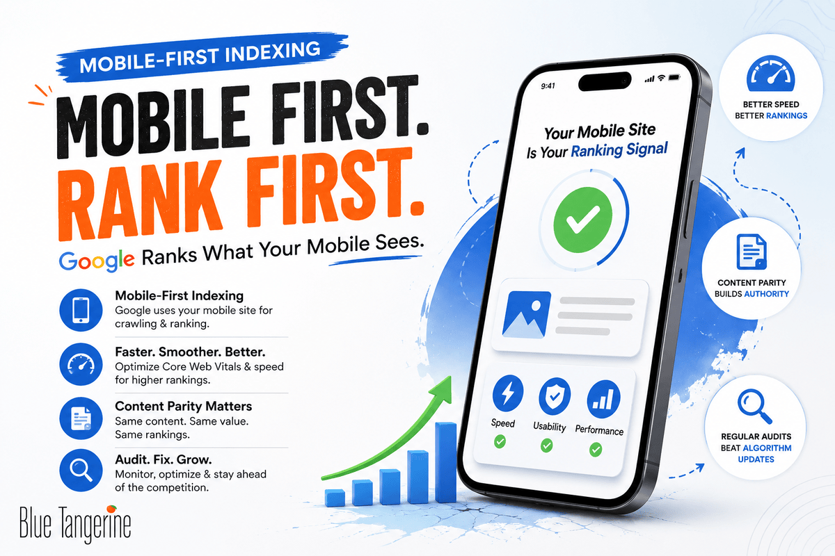
So, what is mobile-first indexing in plain terms? It refers to Google’s practice of using the mobile version of your site as the primary basis for how it crawls, indexes, and ranks your pages. Not the desktop version. The mobile one.
According to Google Search Central, Google crawls sites using its smartphone user agent, and whatever that agent finds on the mobile version of your site is what ends up in the index.
If your desktop site has 800 words on a product page but your mobile version only shows 200 because someone collapsed the rest into an expandable section, Google is working with those 200 words. That is the version being evaluated for rankings.
The transition to this system is not ongoing anymore. This has been the case for more than a year now, and sites that haven’t changed are seeing a drop in their search performance.
When did Google start mobile first indexing?
A lot of people don’t know that Google started to show the change a long time ago. In April 2015, the so-called “Mobilegeddon” update made mobile-friendliness a ranking factor for the first time.

The more meaningful change came in 2016 when Google began quietly experimenting with indexing the mobile version of pages first. That experiment expanded gradually across different domains over several years.
By October 2023, Google announced the rollout was substantially complete. The final cutover for any remaining desktop-crawled sites happened in mid-2024.
According to Statista and multiple analytics providers, mobile devices account for 62%+ of global web traffic as of mid-2025.
In markets like the UAE, where smartphone penetration is particularly high, people are doing the majority of their searching on a phone. Google’s indexing method had to reflect that reality.
What does mobile first indexing mean in seo, and how is it different from just having a mobile-friendly site?
What does mobile first indexing mean in seo goes further than passing Google’s mobile-friendly test or having a layout that resizes for smaller screens.
It means Google is pulling the actual content, structured data, metadata, headings, images, and internal links from your mobile version to determine where your pages rank.
A site can look fine on a phone and still have serious problems. If your mobile layout hides content inside accordion panels, loads certain sections only after a user clicks, or strips out entire blocks that exist on desktop, Google is not seeing that content.

Search Engine Land, which is now part of the Semrush family, has made this point clearly: content missing from the mobile version is content that simply does not count toward your rankings.
How does mobile first indexing affect your website?
The truth is that it depends on how your site is set up. If you have a properly built responsive design where mobile and desktop share the same HTML and content, you may have very little to worry about.
But if your site was designed with desktop as the default and mobile as an afterthought, or if you are running a separate m-dot subdomain, the impacts can be significant, and they tend to compound over time.
Mobile first indexing in digital marketing tends to surface problems in a few recurring ways. If your mobile pages are lighter versions of the desktop pages, whether that is fewer product details, shorter category descriptions, or missing testimonials, those gaps directly affect which keywords you rank for and how well.
Page speed is another area where sites regularly get hurt. A two-second difference in mobile load time is associated with a 32% increase in bounce rate, per data cited by a Google study.
Google’s Core Web Vitals, specifically Largest Contentful Paint, Interaction to Next Paint, and Cumulative Layout Shift, are measured on mobile first.

What is the mobile first approach, and which site configuration makes the most sense?
From a technical point of view, Google says there are three ways to do mobile first: responsive design, dynamic serving, and separate URLs.

Google suggests using responsive design. It has one URL and sends the same HTML to all devices. It uses CSS media queries to change the layout based on the size of the screen. From a technical SEO standpoint, this removes a whole class of problems.
Can I track mobile first indexing status on leading webmaster tools?
You can, and Google Search Console is the most direct place to do it. The Mobile Usability report in Search Console points out problems that affect how Google interacts with your mobile pages. For example, it might say that your content is wider than the viewport, that clickable elements are too close together, or that the text is too small to read without zooming.
The URL Inspection tool is also worth using regularly. It shows you the rendered version of any page as Google’s smartphone crawler sees it. If content is missing from that rendered view, it is not making it into the index, regardless of what your desktop version looks like.
Google suggests that you check both versions of a site in Search Console if it has separate mobile and desktop versions. This way, you will have all the data for each.
What are the best tools to check mobile first indexing for my website?

You should run a mobile first indexing checker as part of your regular audit cycle, not just once and forget about it. A few tools are worth keeping in rotation.
Google Search Console covers the fundamentals and costs nothing. The Mobile Usability report and Coverage report used together give you a solid picture of what Google is actually seeing and whether any pages have crawl or rendering problems.
PageSpeed Insights is the right place to check Core Web Vitals scores specifically for mobile, since it pulls from both real Chrome user data and lab testing.
Google Lighthouse, accessible through Chrome DevTools, lets you run audits with network throttling and CPU slowdown to replicate realistic mobile conditions.
Screaming Frog can crawl your site as Googlebot Smartphone, which is useful for spotting blocked resources, redirect chains on mobile, pages with missing mobile metadata, or content that does not render in the mobile crawl.
The Site Audit module from Semrush adds checks that are specific to mobile devices on top of all of this. It also connects crawl results to actual ranking and indexing behavior through its Search Console integration.
How do I enable mobile first indexing on my e-commerce platform?
Google evaluates your site and determines its mobile readiness automatically based on what it finds during crawling.
For Shopify stores, the built-in themes are responsive by default, which is a reasonable foundation. But responsive does not automatically mean everything is working correctly for indexing.
How can I improve my site’s mobile first indexing score using popular SEO platforms?
Mobile first indexing in digital marketing affects almost every part of a website, so it’s better to make changes to several things at once than to make just one change.
Starting with Core Web Vitals makes sense because they have the most direct connection to ranking outcomes right now. PageSpeed Insights and Lighthouse will tell you where your LCP is coming from, if the layout is changing while the page loads, and how long it takes for interactions to register.
Most of the common problems can be fixed by compressing images, changing them to WebP format, avoiding render-blocking scripts, and setting up the right browser caching.
After that, a content parity audit is worth doing. Screaming Frog crawled as Googlebot Smartphone is a reliable way to see what content Google can actually read on your mobile pages. Comparing that output against your desktop sitemap will show you any headings, descriptions, FAQs, or other text that exists on the desktop but is missing from the mobile crawl.
Keeping metadata consistent is also important. Both the desktop and mobile forms must have the same title tags and meta descriptions. One of the most common issues that Search Console finds is mobile meta descriptions that are missing or don’t match. This can change both how pages rank and how they appear in the results.
Which analytics services offer mobile first indexing reports?

Utilizing Google Search Console is the best way to find out if your website is being searched. Within the Core Web Vitals part, LCP, CLS, and INP are talked about for both PC and mobile users.
Sometimes, Search Console doesn’t find technical problems on its own, but Semrush’s Site Audit can. In addition to finding problems that only show up on mobile devices, it also lets you see crawl data and word rankings at the same time.
If you rank consistently higher on desktop for certain terms, that pattern usually points to something on the mobile side that needs attention.
Google Analytics 4 rounds this out at the behavior level. Segmenting by device category and comparing bounce rates, session duration, and conversions between mobile and desktop shows the business impact. If mobile users are leaving significantly faster than desktop users despite similar traffic volumes, that behavioral pattern can eventually feed back into rankings.
Mobile first indexing is the standard. It has been for a while now, but plenty of sites are still catching up to what that actually demands in practice. Getting it right is not a one-time project. It requires consistent attention across content, technical setup, page speed, and regular auditing.
Running a mobile first indexing checker on a routine basis, keeping content tight between desktop and mobile, defaulting to responsive design, and watching Core Web Vitals specifically from a mobile perspective are the habits that keep rankings stable when Google rolls out its next update.
Contact our professionals at Blue Tangerine to get started!